The New Site Design
Some of you have asked about my new site design, and the reasons behind some of my choices. Rather than explain them individually, I thought I'd drop them all here.
The original site design dates back to 2016. I did most of it myself, with the exception of some help from my sage web advisor – Jeff Mueller. I was happy with it for a long time – nearly four years. There were things that I wanted to add in an effort to make it more modern that I had zero idea how to implement. The development time for me to sit down and figure it out piled up to not be worth it.
And it finally hit me: why not have someone else do this work? There are many times where giving this work to someone else can free you to do what you hadn't before. I do this in other aspects of my personal life, so why not this? So that's when I set down this path, and really embraced this new direction. This time, rather than ask for advice, I contracted out the work to Jeff.
I found a WordPress theme that I liked, but I knew I wanted to make it much more my own. I wanted to implement some things that I had seen elsewhere: a light/dark theme which automatically switches based on your device preferences, code blocks with line numbers, and better support for images with captions. Things that make it feel more in-tune with the improvements in technology and not stuck in the past. It was a relief to not have to dive into the code and tweak it, but rather to give direction as to what to fix and let someone do the work.
The only thing left for me to decide were the theme colors. I had been using a yellow and gray for my last theme. And while I still enjoy that color combination a lot, it doesn't work at all for a light theme, which pushed me to choose something different. So naturally, I started out with a completely different color than most – blue.
Blue is fine. Blue is ok. But blue is used by so many others. Just take a look at your home screen on your phone, tablet, or computer and you'll see a sea of blue in a lot of cases. So, I decided to not to go down the road of so many others. I looked a few other options – some greens and teals – but nothing really jumped out at me. Then, while changing my watch band one evening, it hit me:
Dragon Fruit.
I have had a dragon fruit sport loop band since Christmas. It is my favorite Apple Watch band that I own because it was a gift from my partner (she's amazing) and it's just a solid color choice.[1] I cannot tell you how often I wear this because it pairs so well with the grayscale pallet, from white to gray to charcoal to black. So I put that color against a light and dark background that came from some Drafts theme colors, and was instantly in love. Pair that with a nice mid-gray which works for both, and I had my palette.

This is where the logo journey started. I wanted something different, something new. The same day that I thought about a site redesign and a new logo, I saw a post from another Jeff – Jeff Perry. He was offering to do some work to help others, and boy did I need it. There were a lot of back and forth discussions and directions with him about the logo. Too many. And all of that my fault, as I didn't exactly know where I wanted to go with all of it.
There were multiple iterations of a design. I enjoyed the first logo a lot. I liked the whole idea of having a vague looking N surrounding an homage to Drafts. The idea was clean, but ultimately decided not to go this path because I thought it looked a bit too much like a business card and not something I would want for a website.
Then I went to another extreme: what if I created a design of glyphs to show what my site is about (most of the time). I liked this idea a lot too. But it looked more like an infographic than a logo. It would be a chunky item to put at the top of the page. I do still like this a lot, and might incorporate some of the design aesthetic into posts in the future, but I ultimately didn't pursue this direction further.
Then I went back to basics, and hated myself a bit. This… is awful. I'm ashamed of it. So why not discuss it and show it off? It really comes down to this: in searching some logo designs, I saw a lot of line/dot art that looked like an object. And while this worked in practice for other designs, it is a horrible design for what I wanted. And I won't mention it again. Ever.
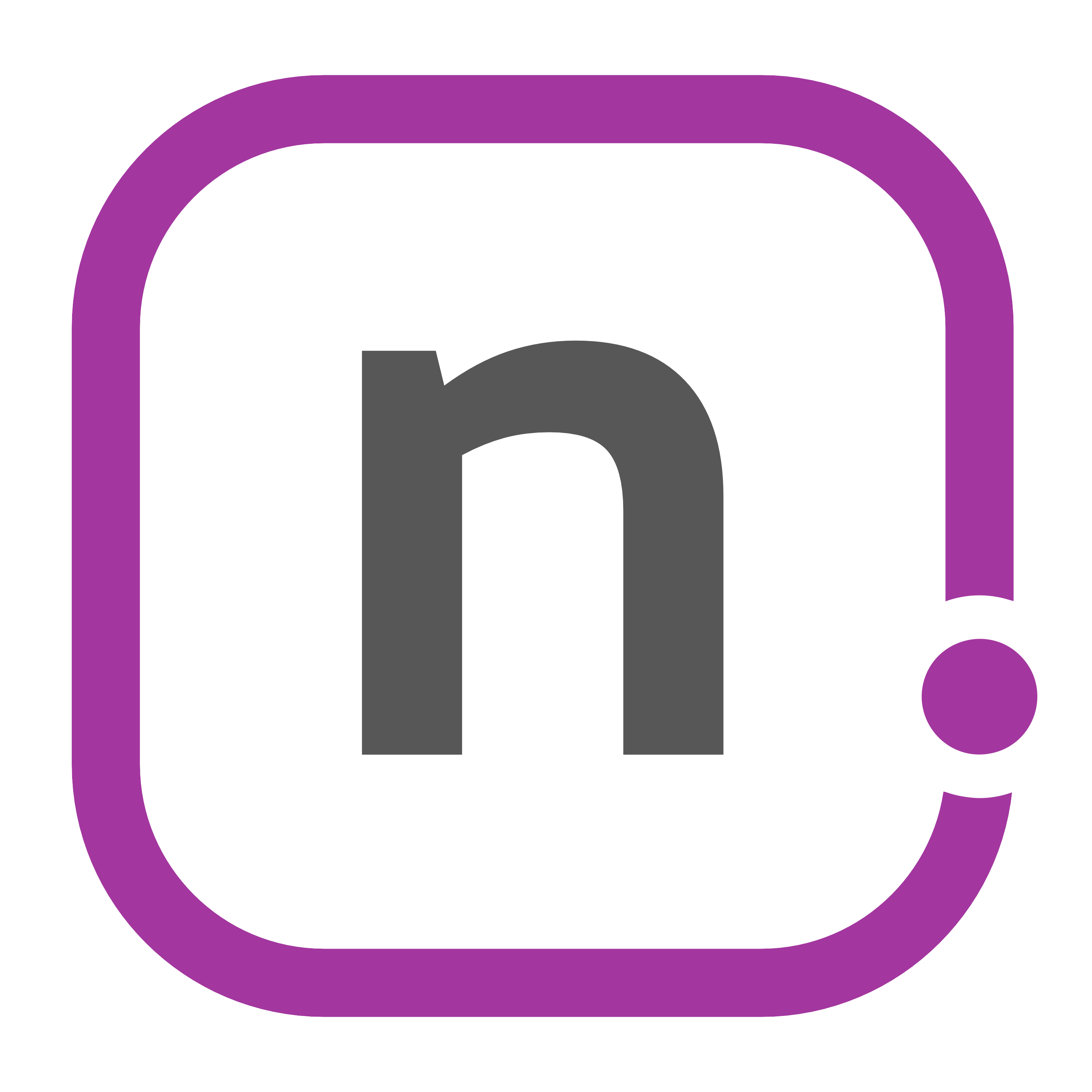
I went further back. When a job goes wrong, you go back to the beginning. All the way back to my first logo. It was simply the n in the font choice of my website. I really only ever used it for my favicon, and no where else. I always had nahumck.me up on top. So I went into Pixelmator, and put that on the canvas in text. I started thinking about what I could do to break it up. This lead me to a line, which lead me to a rectangle. and that's when it all started coming together. I'll break up the nahumck and the me with a box, where the period would be a do which breaks up the box.
Now, that's not much of a logo. But if I took it down to where I started originally – with a simple n – it might work best. So I handed this off to Jeff, and he created the final version. The corners became more rounded and the line stopped closer to the dot and also followed the outline of it. I loved this little touch in the design. This is what I will use going forward for the website, and I absolutely love it!
It was a process to get this done. Working with the Jeffs was easy, even if I was stressed in my head. Going through some tough discussions and decisions to make way for something bold is fantastic. I was stuck in a rut with the colors at first, much like my writing. But I realized this needed to change. I would have never chosen dragonfruit as my initial color, but I'm happy that it turned into what I ultimately wanted. I was looking to go with a different idea for a logo, but ultimately went with something familiar yet modern. Even better, I'll have a new visual in Drafts for my previews in the future, so the new themes will be everywhere.
I'm happy that this has all worked out for the better. I hope that you enjoy it as much as I do. And who knows: maybe there are some stickers and shirts in the future…
The Nike Pride band is a close second. ↩︎